Interactions
Interaction elements are defined as having some form of user engagement.
Reveals
What does the CHN require in order to effectively engage in the strategies listed above?
The CHN needs a good working knowledge of...
<p>What does the CHN require in order to effectively engage in the strategies listed above?</p>
<div class="reveal" data-button="Answer">
<p>The CHN needs a good working knowledge of...</p>
</div>
What does the CHN require in order to effectively engage in the strategies listed above?
#reveal
Button: Answer
The CHN needs a good working knowledge of...
/reveal
Reveals are useful for question/answer-type engagement where the question is more than one line of text.
The default button text is Reveal; if you would like the button to say something else, please add Button: some text, like in the Word example.
Active Reveals
An input text box can also be added to a reveal, requiring the student to type something into the text box before the reveal button becomes clickable. To add an input text box, add min-text: some number below the #reveal marker in your Word document.
You can also add some placeholder/initial text in the input box, such as "Type your answer here". To do so, include placeholder: some initial text under min-text: some number.
The min-text: specifies the minimum amount of characters the student needs to type in the input box before they can click on the reveal button. A typical one-line sentence has approximately 90 characters.
Developer Notes
Button text is set by the data-button attribute value.
Active Reveals
Use the class active-reveal, instead of reveal.
The following are attributes that can be used for Active Reveals:
- data-button
- data-min-text
- data-placeholder
- data-rows (changes the size of the input box)
Accordions
Tolerance Levels
The human body has tolerance levels...
Multiple Kinds of Energy
The interaction of two or more kinds of energy...
<div class="accordion">
<h2>Tolerance Levels</h2>
<p>The human body has tolerance levels...</p>
<h2>Multiple Kinds of Energy</h2>
<p>The interaction of two or more kinds of energy...</p>
</div>
#accordion
Tolerance Levels
The human body has tolerance levels...
Multiple Kinds of Energy
The interaction of two or more kinds of energy...
/accordion
Accordions help the user navigate through related content on a page. Content can be text, an image, a table, a list, etc.
Avoid using an accordion if it will result in a single panel as opposed to one or more panels. Also, consider using a reveal element instead of an accordion if the content has more of a question/answer type format.
Accordions are not always the best solution for consolidating information. See the Nielsen Norman Group's research on accordion user interface problems.
Developer Notes
You can add class="collapsing" to the wrapper to modify behaviour so that when a new accordion button is opened, others are closed.
This can be very disorienting and quite difficult to compare content. Use sparingly.
Tabs
Northwest Territories
tab-text: Northwest
- Capital: Yellowknife
- Entered Confederation: 1870
Yukon
- Capital: Whitehorse
- Entered Confederation: 1898
Nunavut
- Capital: Iqaluit
- Entered Confederation: 1999
<div class="tabs">
<h2>Northwest Territories</h2>
<p>tab-text: Northwest</p>
<ul>
<li>Capital: Yellowknife</li>
<li> Entered Confederation: 1870</li>
</ul>
<h2>Yukon</h2>
<ul>
<li>Capital: Whitehorse</li>
<li>Entered Confederation: 1898</li>
</ul><h2>Nunavut</h2>
<ul>
<li>Capital: Iqaluit</li>
<li>Entered Confederation: 1999</li>
</ul>
</div>
#tabs
Northwest Territories
tab-text: Northwest
- Capital: Yellowknife
- Entered Confederation: 1870
Yukon
- Capital: Whitehorse
- Entered Confederation: 1898
Nunavut
- Capital: Iqaluit
- Entered Confederation: 1999
/tabs
Tabs help to organize content and reduce the amount of scrolling required to view information. Content can be text, an image, a table, a list, etc.
The location of the tabs navigation can be changed from the default right-side to top, bottom, or left-side.
Each tab can be customized with a different colour.
Developer Notes
Tabs Position
You can change the position of the tabs navigation from left-side to others by adding the class bellow:
<div class="tabs nav-top"><div class="tabs nav-bottom"><div class="tabs nav-left">
Tabs Colour
You can change the colour of individual tabs by adding the data attribute with the choice of colour bellow on the <h2> tag:
<h2 data-color="blue"><h2 data-color="#0000FF">
You can also change it to only using one colour (green) by adding:
<div class="tabs mono-color">
Tabs size
You can make the size of the tabs larger by adding the class bellow:
<div class="tabs large"><div class="tabs larger"><div class="tabs largest">
Swappers
Try this activity
After researching your topic...
<div class="swapper">
<div class="activity">
<h3>Try this activity</h3>
<p>After researching your topic...</p>
</div>
<figure class="image smaller">
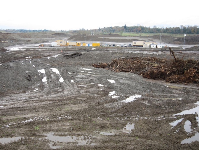
<img src="/assets/mining-pit-operations.jpeg" alt="a photograph of a mining operation" />
<figcaption>Mining Pit Operations</figcaption>
</figure>
<figure class="image smaller">
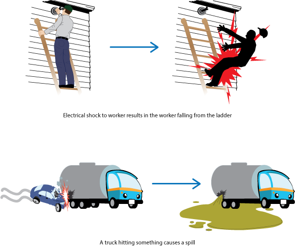
<img src="/assets/multiple-energies.png" alt="a graphic of different kinds of multiple energies" />
</figure>
<figure class="video smaller">
<iframe src="https://www.youtube.com/embed/lOT0GOyw2pY" allowfullscreen>
</iframe>
<figcaption>Great video</figcaption>
</figure>
</div>#swapper
#activity
Try this activity
After researching your topic...
/activity
#image
Alt: a photograph of a mining operation
Mining Pit Operations
/image
#image
Alt: a graphic of different kinds of multiple energies
/image
#video
Source: https://www.youtube.com/embed/lOT0GOyw2pY
Great video
/video
/swapper
Although the swapper can be used to display almost any type of content, it's best to use it with related media.
Line-Matching
Match the following academic programs to the appropriate School at BCIT.
| School | Program |
|---|---|
| School of Energy | Power Engineering |
| School of Health Sciences | Nuclear Medicine |
| School of Business | Human Resource Management |
| School of Computing & Academic studies | Technical Web Design |
| School of Transportation | Aircraft Maintenance Technician - Avionics |
| Civil Engineering | School of Construction & the Environment |
<div class="line-matching">
<p>Match the following academic programs to the appropriate School at BCIT.</p>
<figure class="table">
<table>
<thead>
<tr>
<th>School</th>
<th>Program</th>
</tr>
</thead>
<tbody>
<tr>
<td>School of Energy</td>
<td>Power Engineering</td>
</tr>
<tr>
<td>School of Health Sciences</td>
<td>Nuclear Medicine</td>
</tr>
<tr>
<td>School of Business</td>
<td>Human Resource Management</td>
</tr>
<tr>
<td>School of Computing & Academic studies</td>
<td>Technical Web Design</td>
</tr>
<tr>
<td>School of Transportation</td>
<td>Aircraft Maintenance Technician - Avionics</td>
</tr>
<tr>
<td>Civil Engineering</td>
<td>School of Construction & the Environment</td>
</tr>
</tbody>
</table>
</figure>
</div>
#line-matching
Match the following academic programs to the appropriate School at BCIT.
| School | Program |
|---|---|
| School of Energy | Power Engineering |
| School of Health Sciences | Nuclear Medicine |
| School of Business | Human Resource Management |
| School of Computing & Academic studies | Technical Web Design |
| School of Transportation | Aircraft Maintenance Technician - Avionics |
| Civil Engineering | School of Construction & the Environment |
/line-matching
The order of the matching terms is automatically randomized.
Text Length
Ideally, text for both questions and answers should be kept to a maximum of 140 characters.
Large amount of text will have a reduced font size and may not provide the best user experience for students when using this interaction.
Multimedia
While multimedia elements like images and videos can be accommodated into this interaction, it is not recommended as size restrictions will prevent them from being rendered in their best quality.
Checklists
Technical Issues in Software Development
- Draw a flow chart in Visio
- Describe functionality
-
Assignment 1
@
After submitting your assignment, please take the Week 2 quiz.
- Write pseudo code
<div class="checklist">
<p>Technical Issues in Software Development</p>
<ul>
<li>Draw a flow chart in Visio
<ul>
<li>Describe functionality</li>
<li>
<p>Assignment 1</p>
<p>@</p>
<div class="quiz">
<p>After submitting your assignment, please take the Week 2 quiz.</p>
</div>
</li>
</ul>
</li>
<li>Write pseudo code</li>
</ul>
</div>
#checklist
Technical Issues in Software Development
- Draw a flow chart in Visio
- Describe functionality
-
Assignment 1
@
#quiz
After submitting your assignment, please take the Week 2 quiz.
/quiz
- Write pseudo code
/checklist
Feedback
Feedback to be revealed is indicated with the @ symbol.
Feedback should be part of the existing list. To add feedback, press Shift + Enter to create a new line within the list.
Checklists remember that items are marked as done unless you clear your browser's cache.
Developer Notes
Add the class strikethrough to the div if you want completed items to have a line through them.
Custom Interactions
ECG Analysis
<figure class="interaction">
<h2>ECG Analysis</h2>
<iframe src="https://learn.bcit.ca/d2l/lor/viewer/view_private.d2l?ou=6605&loIdentId=36305" height="760" width="750">
</iframe>
<figcaption>Create practice ECG strips with guiding questions for learner knowledge checking</figcaption>
</figure>
#interaction
ECG Analysis
Source: https://learn.bcit.ca/d2l/lor/viewer/view_private.d2l?ou=6605&loIdentId=36305
Create practice ECG strips with guiding questions for learner knowledge checking
/interaction
The multimedia team can develop everything from individual elements to complete course modules, games, simulations, and administrative tools. The final product can be delivered over the Internet via web browser, on mobile devices, installed on desktops, or by physical media such as USB drive or DVD.
Flashcards
| Front | Back |
|---|---|
| What is the capital of Canada? | Ottawa |
| What does HTML stand for? | HyperText Markup Language |
| What is the largest planet in our solar system? | Jupiter |
<table class="flashcards">
<thead>
<tr>
<th>Front</th>
<th>Back</th>
</tr>
</thead>
<tbody>
<tr>
<td>What is the capital of Canada?</td>
<td>Ottawa</td>
</tr>
<tr>
<td>What does HTML stand for?</td>
<td>HyperText Markup Language</td>
</tr>
<tr>
<td>What is the largest planet in our solar system?</td>
<td>Jupiter</td>
</tr>
</tbody>
</table>
#flashcards
Flashcard Example
| Front | Back |
|---|---|
| What is the capital of Canada? | Ottawa |
| What does HTML stand for? | HyperText Markup Language |
| What is the largest planet in our solar system? | Jupiter |
/flashcards
Flashcards are an effective tool for active recall and work well as quick knowledge checks for facts, definitions, formulas, and other key information.
The navigation buttons let users move through the cards, shuffle the deck, flip individual cards, or flip the entire deck at once.
Developer Notes
Here's a complete list of all the table-level styling and <tr> classes for flashcards:
Table-Level Data Attributes
Table Classes
class="flashcards"- Required to activate flashcard functionalityclass="flashcards no-number"- Hides the card counterclass="flashcards no-nav"- Hides navigation controls
Height Control
data-height="500"- Sets fixed height for cards (default: 500px)
Content Alignment (affects all cards)
data-justify-content="flex-start"- Positions all content to the leftdata-justify-content="center"- Positions all content centerdata-justify-content="flex-end"- Positions all content to the rightdata-align-items="flex-start"- Positions all content at the topdata-align-items="center"- Positions all content center verticallydata-align-items="flex-end"- Positions all content at the bottom
Per-Card <tr> Classes (9-Direction Positioning)
Top Row
class="top-left"- Content positioned at top-left with left text alignmentclass="top-center"- Content positioned at top-center with center text alignmentclass="top-right"- Content positioned at top-right with right text alignment
Middle Row
class="middle-left"- Content positioned at middle-left with left text alignmentclass="middle-center"- Content positioned at middle-center with center text alignmentclass="middle-right"- Content positioned at middle-right with right text alignment
Bottom Row
class="bottom-left"- Content positioned at bottom-left with left text alignmentclass="bottom-center"- Content positioned at bottom-center with center text alignmentclass="bottom-right"- Content positioned at bottom-right with right text alignment
Key Points
- Per-card classes override table attributes:
<tr>classes take precedence over table-leveldata-*attributes